Mapping and plotting tools#
GeoPandas provides a high-level interface to the matplotlib library for making maps. Mapping shapes is as easy as using the plot() method on a GeoSeries or GeoDataFrame.
Loading some example data:
In [1]: import geodatasets

In [2]: chicago = geopandas.read_file(geodatasets.get_path("geoda.chicago_commpop"))

In [3]: groceries = geopandas.read_file(geodatasets.get_path("geoda.groceries"))
You can now plot those GeoDataFrames:
# Examine the chicago GeoDataFrame
In [4]: chicago.head()
Out[4]:
community ... geometry
0 DOUGLAS ... MULTIPOLYGON (((-87.609140876 41.844692503, -8...
1 OAKLAND ... MULTIPOLYGON (((-87.592152839 41.816929346, -8...
2 FULLER PARK ... MULTIPOLYGON (((-87.628798237 41.801893034, -8...
3 GRAND BOULEVARD ... MULTIPOLYGON (((-87.606708126 41.816813771, -8...
4 KENWOOD ... MULTIPOLYGON (((-87.592152839 41.816929346, -8...
[5 rows x 9 columns]
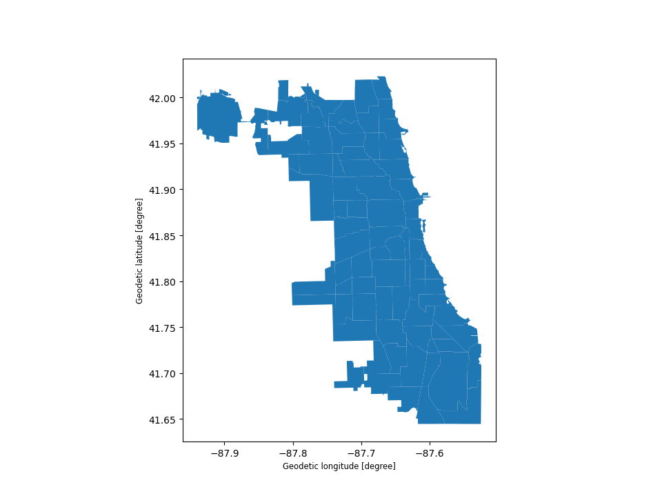
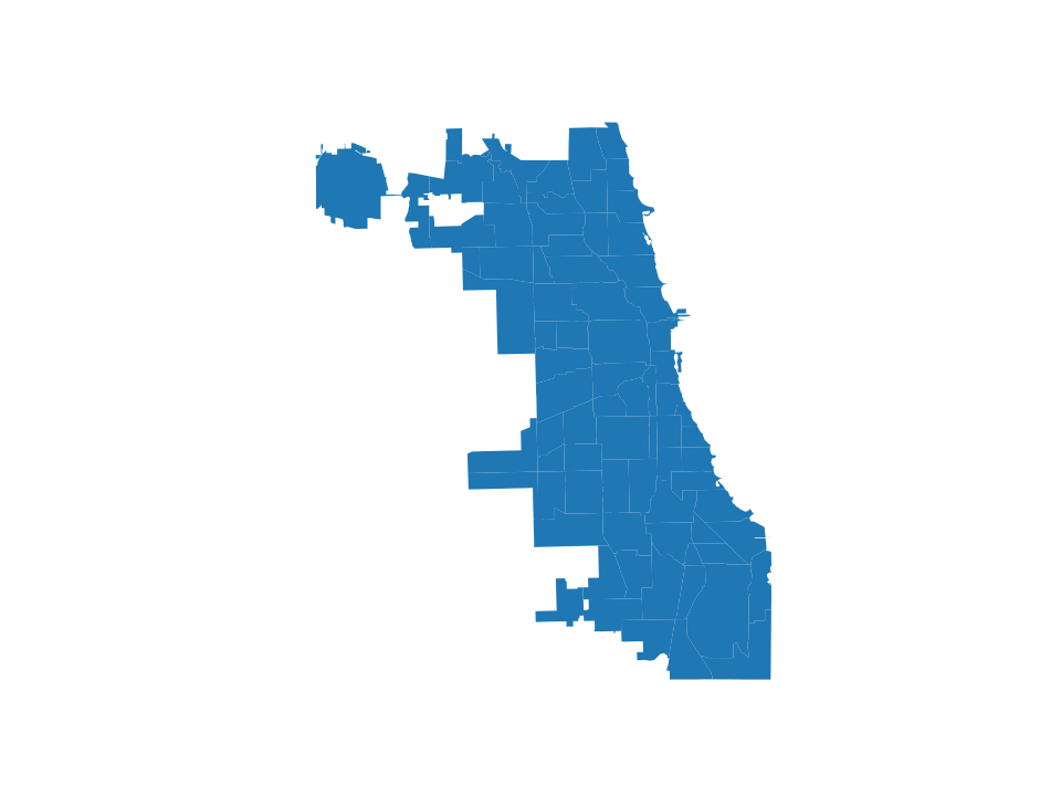
# Basic plot, single color
In [5]: chicago.plot();
Note that in general, any options one can pass to pyplot in matplotlib (or style options that work for lines) can be passed to the plot() method.
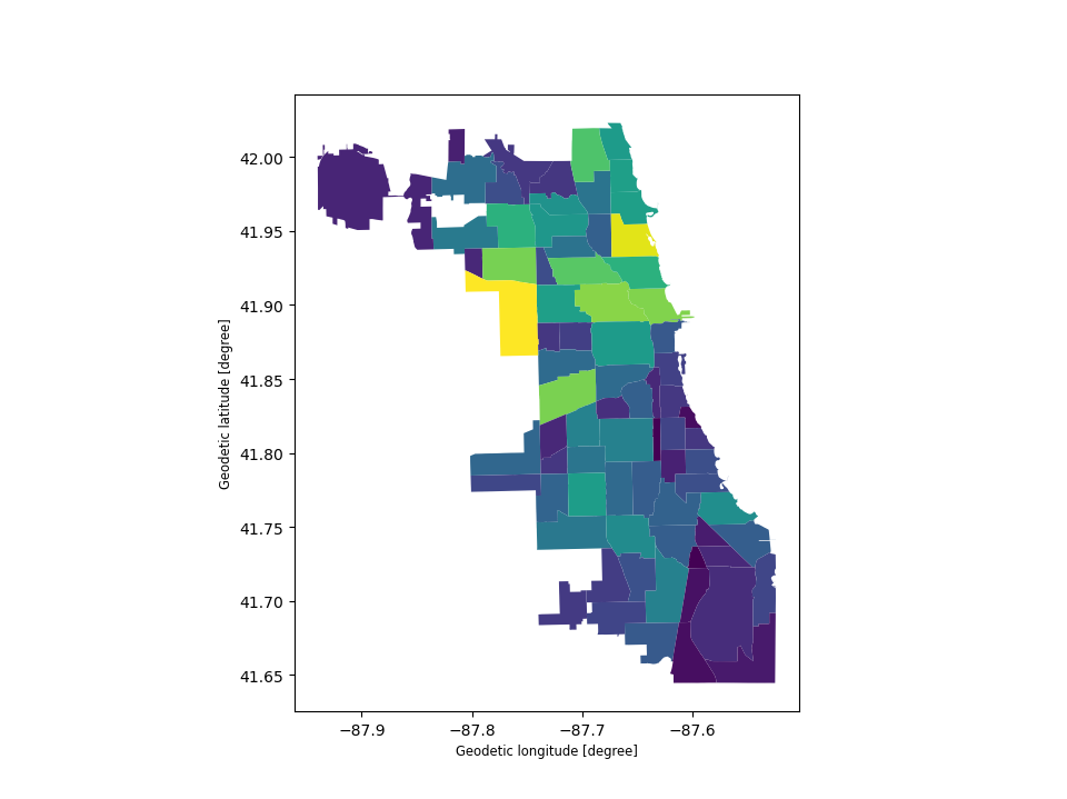
Choropleth maps#
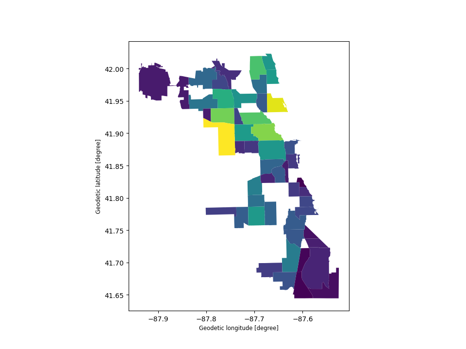
GeoPandas makes it easy to create Choropleth maps (maps where the color of each shape is based on the value of an associated variable). Simply use the plot command with the column argument set to the column whose values you want used to assign colors.
 # Plot by population
In [6]: chicago.plot(column="POP2010");
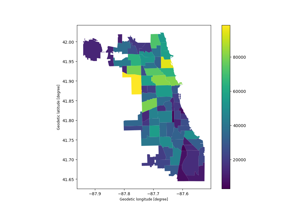
Creating a legend#
When plotting a map, one can enable a legend using the legend argument:
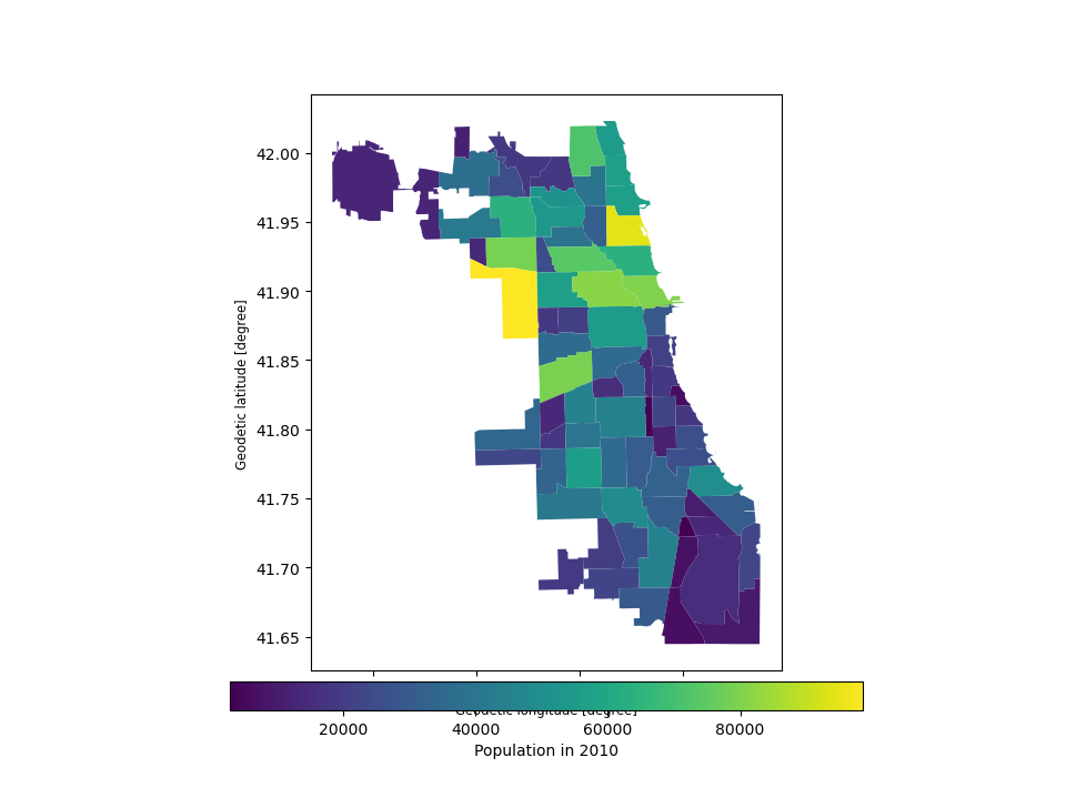
# Plot population estimates with an accurate legend
In [7]: chicago.plot(column='POP2010', legend=True);
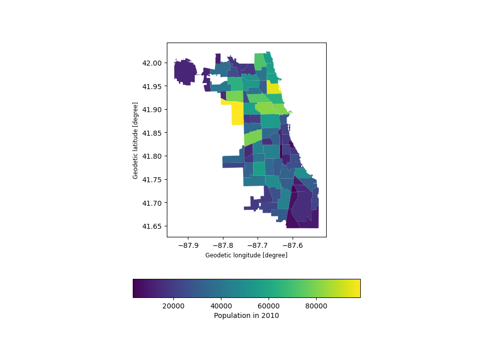
The following example plots the color bar below the map and adds its label using legend_kwds:
# Plot population estimates with an accurate legend
In [8]: chicago.plot(
   ...:     column="POP2010",
   ...:     legend=True,
   ...:     legend_kwds={"label": "Population in 2010", "orientation": "horizontal"},
   ...: );
   ...:
However, the default appearance of the legend and plot axes may not be desirable. One can define the plot axes (with ax) and the legend axes (with cax) and then pass those in to the plot() call. The following example uses mpl_toolkits to horizontally align the plot axes and the legend axes and change the width:
# Plot population estimates with an accurate legend
In [9]: import matplotlib.pyplot as plt

In [10]: from mpl_toolkits.axes_grid1 import make_axes_locatable

In [11]: fig, ax = plt.subplots(1, 1)

In [12]: divider = make_axes_locatable(ax)

In [13]: cax = divider.append_axes("bottom", size="5%", pad=0.1)

In [14]: chicago.plot(
   ....:     column="POP2010",
   ....:     ax=ax,
   ....:     legend=True,
   ....:     cax=cax,
   ....:     legend_kwds={"label": "Population in 2010", "orientation": "horizontal"},
   ....: );
   ....:
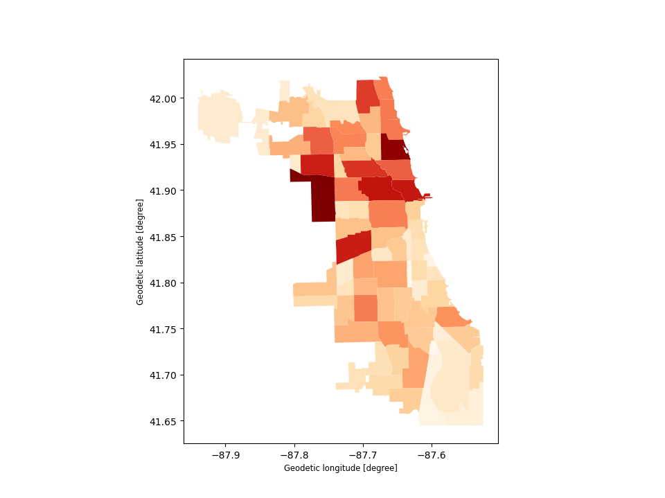
Choosing colors#
You can also modify the colors used by plot() with the cmap option. For a full list of colormaps, see Choosing Colormaps in Matplotlib.
In [15]: chicago.plot(column='POP2010', cmap='OrRd');
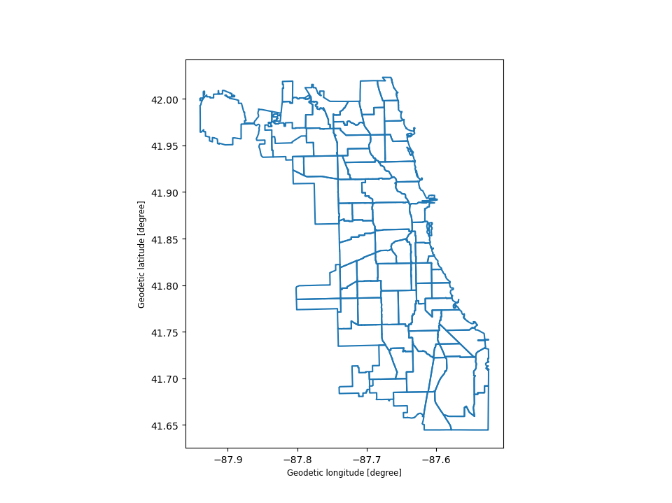
To make the color transparent for when you just want to show the boundary, you have two options. One option is to do chicago.plot(facecolor="none", edgecolor="black"). However, this can cause a lot of confusion because "none" and None are different in the context of using facecolor and they do opposite things. None does the “default behavior” based on matplotlib, and if you use it for facecolor, it actually adds a color. The second option is to use chicago.boundary.plot(). This option is more explicit and clear.:
In [16]: chicago.boundary.plot();
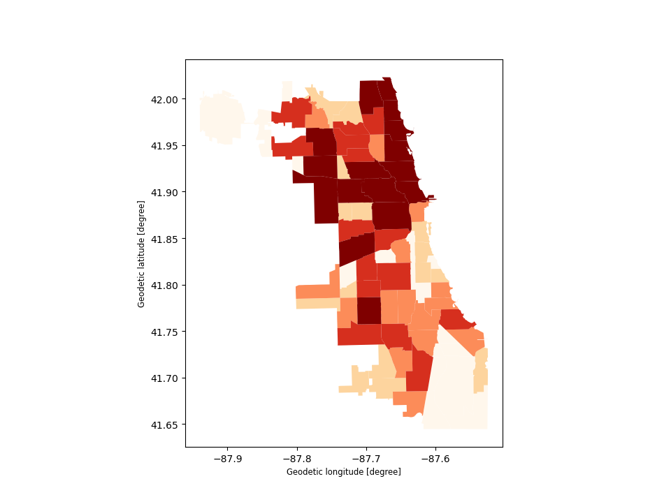
The way color maps are scaled can also be manipulated with the scheme option (if you have mapclassify installed, which can be accomplished via conda install -c conda-forge mapclassify). The scheme option can be set to any scheme provided by mapclassify (e.g. ‘box_plot’, ‘equal_interval’,
‘fisher_jenks’, ‘fisher_jenks_sampled’, ‘headtail_breaks’, ‘jenks_caspall’, ‘jenks_caspall_forced’, ‘jenks_caspall_sampled’, ‘max_p_classifier’, ‘maximum_breaks’, ‘natural_breaks’, ‘quantiles’, ‘percentiles’, ‘std_mean’ or ‘user_defined’). Arguments can be passed in classification_kwds dict. See the mapclassify documentation for further details about these map classification schemes.
In [17]: chicago.plot(column='POP2010', cmap='OrRd', scheme='quantiles');
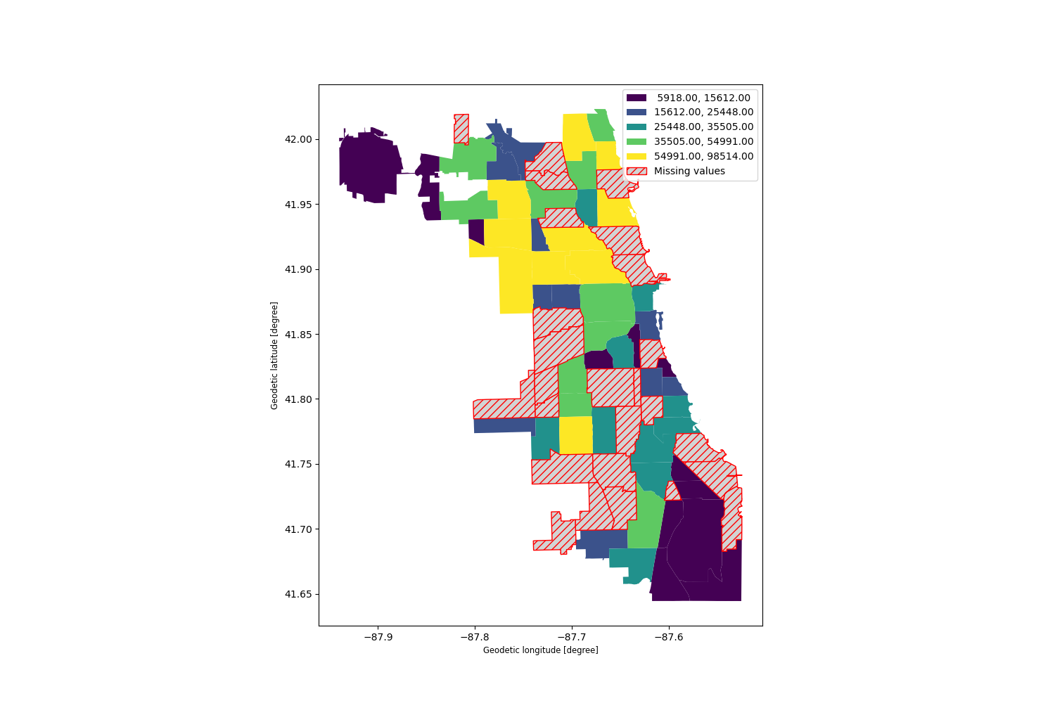
Missing data#
In some cases one may want to plot data which contains missing values - for some features one simply does not know the value. Geopandas (from the version 0.7) by defaults ignores such features.
In [18]: import numpy as np

In [19]: chicago.loc[np.random.choice(chicago.index, 30), 'POP2010'] = np.nan

In [20]: chicago.plot(column='POP2010');
However, passing missing_kwds one can specify the style and label of features containing None or NaN.
In [21]: chicago.plot(column='POP2010', missing_kwds={'color': 'lightgrey'});

In [22]: chicago.plot(
   ....:     column="POP2010",
   ....:     legend=True,
   ....:     scheme="quantiles",
   ....:     figsize=(15, 10),
   ....:     missing_kwds={
   ....:         "color": "lightgrey",
   ....:         "edgecolor": "red",
   ....:         "hatch": "///",
   ....:         "label": "Missing values",
   ....:     },
   ....: );
   ....:

Other map customizations#
Maps usually do not have to have axis labels. You can turn them off using set_axis_off() or axis("off") axis methods.
In [23]: ax = chicago.plot()

In [24]: ax.set_axis_off();
Maps with layers#
There are two strategies for making a map with multiple layers – one more succinct, and one that is a little more flexible.
Before combining maps, however, remember to always ensure they share a common CRS (so they will align).
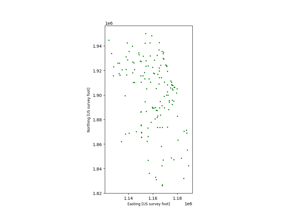
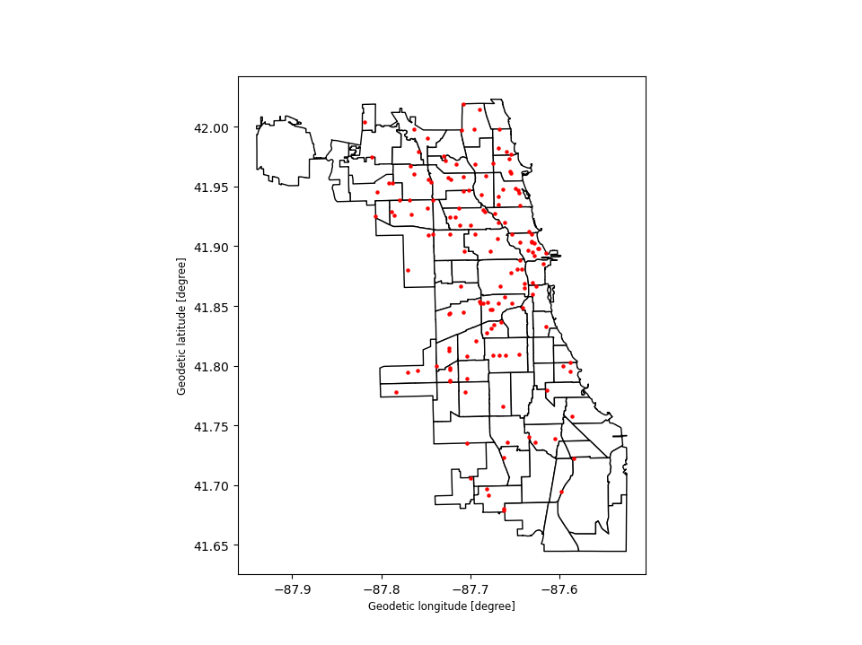
# Look at capitals
# Note use of standard `pyplot` line style options
In [25]: groceries.plot(marker='*', color='green', markersize=5);

# Check crs
In [26]: groceries = groceries.to_crs(chicago.crs)

# Now you can overlay over the outlines
Method 1
In [27]: base = chicago.plot(color='white', edgecolor='black')

In [28]: groceries.plot(ax=base, marker='o', color='red', markersize=5);
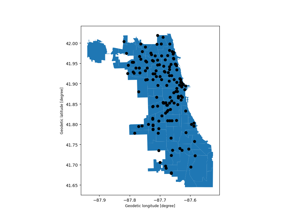
Method 2: Using matplotlib objects
In [29]: fig, ax = plt.subplots()

In [30]: chicago.plot(ax=ax, color='white', edgecolor='black')
Out[30]: <Axes: xlabel='Geodetic longitude [degree]', ylabel='Geodetic latitude [degree]'>

In [31]: groceries.plot(ax=ax, marker='o', color='red', markersize=5)
Out[31]: <Axes: xlabel='Geodetic longitude [degree]', ylabel='Geodetic latitude [degree]'>

In [32]: plt.show();

Control the order of multiple layers in a plot#
When plotting multiple layers, use zorder to take control of the order of layers being plotted.
The lower the zorder is, the lower the layer is on the map and vice versa.
Without specified zorder, cities (Points) gets plotted below world (Polygons), following the default order based on geometry types.
In [33]: ax = groceries.plot(color='k')

In [34]: chicago.plot(ax=ax);

You can set the zorder for cities higher than for world to move it of top.
In [35]: ax = groceries.plot(color='k', zorder=2)

In [36]: chicago.plot(ax=ax, zorder=1);
Pandas plots#
Plotting methods also allow for different plot styles from pandas
along with the default geo plot. These methods can be accessed using
the kind keyword argument in plot(), and include:
geofor mappinglinefor line plotsbarorbarhfor bar plotshistfor histogramboxfor boxplotkdeordensityfor density plotsareafor area plotsscatterfor scatter plotshexbinfor hexagonal bin plotspiefor pie plots
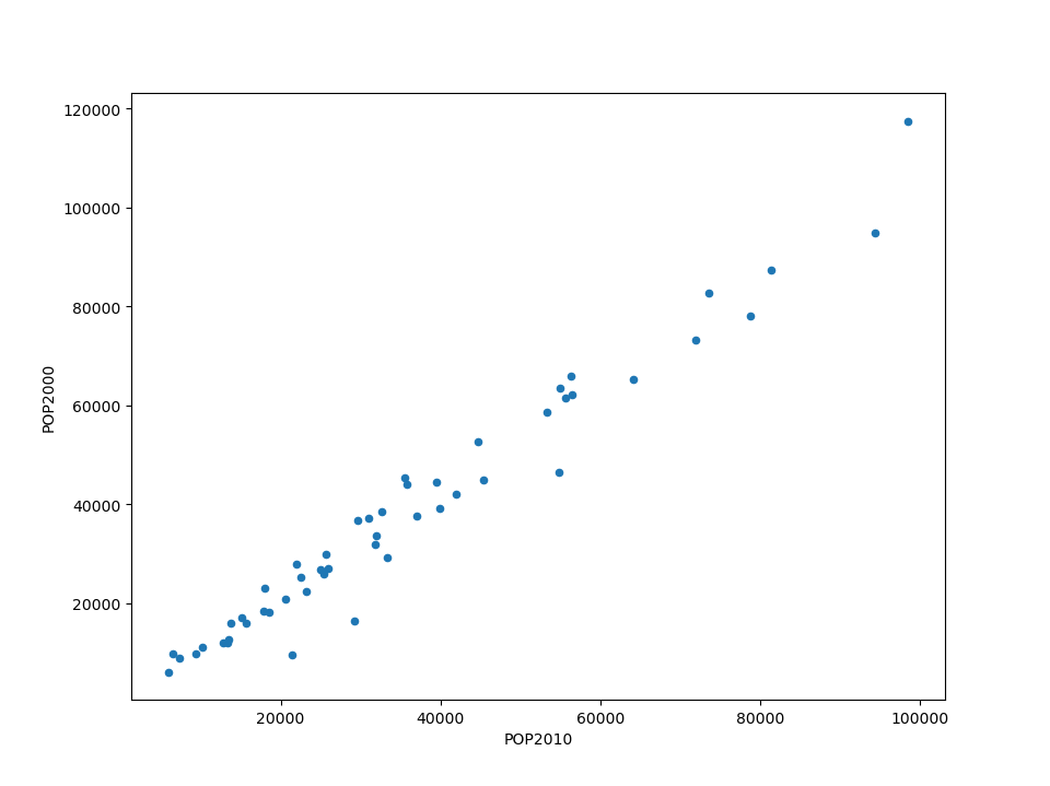
In [37]: chicago.plot(kind="scatter", x="POP2010", y="POP2000")
Out[37]: <Axes: xlabel='POP2010', ylabel='POP2000'>
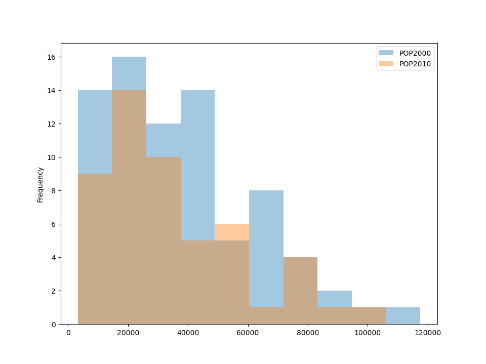
You can also create these other plots using the GeoDataFrame.plot.<kind> accessor methods instead of providing the kind keyword argument.
For example, hist, can be used to plot histograms of population for two different years from the Chicago dataset.
In [38]: chicago[["POP2000", "POP2010", "geometry"]].plot.hist(alpha=.4)
Out[38]: <Axes: ylabel='Frequency'>
For more information, see Chart visualization in the pandas documentation.
Other resources#
Links to Jupyter Notebooks for different mapping tasks: